As part of the ASU digital ecosystem, ASU email design standards are based on ASU web standards. Any nuances specific to email are noted below — for all other design standards, please see the specifics in the asu.edu UI kit linked below.
The template provided for your use in Salesforce Marketing Cloud includes these styles.
- Color palette
- Typography
- Spacing and layout
- Iconography
- Backgrounds (patterns)
- Buttons and links
- Lists
- Quotes and testimonials
Logos in headers and footers
- Headers and footers can contain your unit’s endorsed logo or the university logo with your unit name underneath if you do not have an endorsed logo.
- See ASU logo standards for more information on when and how to use each university or unit logo.
Text
- Copy should always be left-aligned, where it makes sense, to aid in accessibility.
- Body copy should be no less than 16px to aid in accessibility.
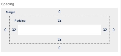
Padding on text blocks should be no less than 32px on all sides. If you have two individual text blocks next to each other, the sum of the padding between them should be no less than 32px. (For instance, the bottom padding of one and top padding of the other should each be 16px so they equal 32px of padding where they are touching.)

Images
- Ensure images are scaled to the exact size you want them to appear when uploading. Generally, do not check “Scale to fit” button for images — this command will break in Outlook and the image will render at actual size.
- Images must be smaller than 2MB to upload to Marketing Cloud, otherwise the file upload will error. In best practice, images should typically be less than 1MB. We recommend tinypng.com to reduce image file sizes.
- Make sure your content can be consumed and understood without images. Images aren’t always on by default, especially for internal audiences using Outlook.
Videos and GIFs
- Steer clear of embedded videos. Videos currently do not render natively in most email clients. For consistency, you should not embed a video directly into any email.
- A good alternative to embedding a video in an email is to include an image or a GIF with a play button imposed on top to encourage users to click through to the video hosted on an external site. We recommend this Font Awesome play button (download as a png file, black | white).
- GIFs should typically loop for 12–15 seconds or less.
- You can use giphy.com to host your GIFs, but they must be under 25MB. Additionally, GIFs hosted on giphy.com natively render at 480px wide.
- Make sure your GIF doesn’t distract from the main call to action of your email (unless clicking through to the video is the desired action of the reader).
