Either the ASU logo or an official ASU unit logo is the only graphic identity mark for all university campuses, units and endeavors. The logo must be included on all materials. Use of the ASU logo indicates agreement to abide by the university standards within the brand guide.
- When multiple university units are represented, the logo of the umbrella unit that represents all of them should be used. In some cases, a college or school is the umbrella under which the units may be represented.
- In cases that cross units or report through different branches of the university, the university logo should be used as the umbrella. References to individual units themselves should occur in text format only.
The ASU sunburst
The sunburst logo was introduced in 1995, replacing all preexisting ASU logos. The logo is made up of a sun icon that is incorporated into the three letter forms (A, S and U) and provides a strong and recognizable graphic image of ASU’s mission and purpose.
Official logo versions
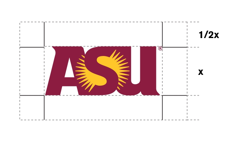
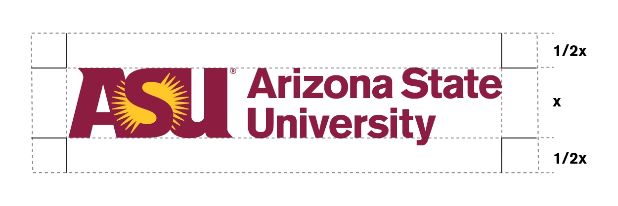
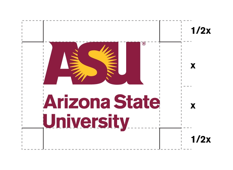
Use the original, high-quality graphic files and do not change them. Do not scan or recreate the logo. Do not use bitmapped images such as Tiff or Pact file formats for offset printed materials because of their poor reproduction quality.
High-quality files can be downloaded from the ASU Brand Library. By downloading the logo you are agreeing to abide by the university standards within the brand guide.
The EPS file format is scalable for high quality reproduction. Do not create additional file types, like SVG for the logos as these are not approved. PNG files are primarily used in digital materials.
Download ASU logo files
Note: By downloading the logo you are agreeing to abide by the university standards within the brand guide.
Options available for download from the ASU Brand Library
Learn how to access the ASU Brand Library