ASU Brand Guide - Elements of the Brand

Elements of the ASU brand

Color palette

The ASU brand color palette

ASU Color Wheel

Things to consider when using the ASU color palette:

  • ASU Maroon and ASU Gold are recognizable as brand-specific colors and should be first choice considerations when selecting color elements for your project. 
  • ASU Rich Black and White serve as foundational contrast colors that allow maroon and gold to shine.
    • Unless printing in one color (black ink), black and white should not be used without a primary brand color — ASU Maroon or ASU Gold — to represent the brand.
  • ASU Green, Blue, Orange, Copper, Turquoise, Pink and Gray are considered secondary colors for the ASU brand.
    • They may not be used without ASU Maroon or ASU Gold to represent the brand and they may not overpower (appear in larger quantities than) the primary brand colors. They should be used as accent colors.
  • ASU grayscale is a scale of seven grays that can be used when lighter and darker gray values are needed for designs, beyond ASU Gray. ASU Gray should always be the primary gray in use.
  • Use the correct color formula for your project, whether digital, print or web, to ensure colors are accurately represented.

    See 
    Understanding which color build to use for your project.
  • For all colors, be aware of accessibility when selecting background and text color combinations. Without strong contrast, many sighted readers will struggle to read your text — or worse, they may choose not to. 
    • Test the contrast of your text and background color pairings, using Hex code or HTML values. Color combinations should meet or exceed AA level.
    • Common pairings to avoid include: 
      • Gold text on white background, white text on a gold background 
      • Maroon text on a black background and black text on a maroon background

ASU primary colors

ASU Maroon and Gold, Rich Black and White are ASU's primary colors. Over many years, ASU has built brand equity in maroon and gold. These two colors define who we are as an educational institution and all digital and multicolor print designs should lead with the primary brand colors.


ASU Maroon

CMYK 10-97-37-43

RGB 140-29-64

HTML #8C1D40

See Custom spot colors for print below.

ASU Gold

CMYK 0-21-88-0

RGB 255-198-39

HTML #FFC627

See Custom spot colors for print below.


ASU Rich Black

CMYK 60-40-40-100

RGB 0-0-0

HTML #000000

ASU White

CMYK 0-0-0-0

RGB 255-255-255

HTML #FFFFFF

ASU secondary colors

  • The use of secondary colors should be done sparingly and with the intention, ideally adding meaning or clarity to the creative item. They should complement the primary brand color palette.
  • These colors are not to be used in a dominant way or in lieu of the primary colors. If ASU Maroon, Gold, Rich Black and White have already been used in a project, the secondary palette may be useful when used in limited ways. 
  • The secondary palette is helpful when building complex data visualizations such as charts, graphs and maps that may require several colors for clearer reading and comprehension.


ASU Green 

CMYK 60-0-100-0

RGB 120-190-32

HTML #78BE20

PANTONE 368 C

ASU Blue 

CMYK 80-15-0-0

RGB 0-163-224

HTML #00A3E0

PANTONE 299 C

ASU Orange 

CMYK 0-60-85-0

RGB 255-127-50

HTML #FF7F32

PANTONE 1575 C

ASU Gray

CMYK 2-0-4-66

RGB 116-116-116 

HTML #747474

PANTONE 424 C


ASU Copper 

CMYK 24-66-76-10

RGB 175-103-75

HTML #AF674B

PANTONE 7522 C

ASU Turquoise 

CMYK 68-0-21-0

RGB 74-183-196

HTML #4AB7C4

PANTONE 2227 C

ASU Pink 

CMYK 0-83-16-0

RGB 231-73-115

HTML #E74973

PANTONE 205 C


In 2022, ASU CopperTurquoise and Pink were added to the secondary color palette after a rigorous process involving in-depth color research and a series of community design studios to understand the needs and challenges of those using the ASU color palette in their daily communications work. The new colors were chosen as a reference to honor our sense of place. These new colors connect to Arizona — our ecology, geology, people, communities and history:

  • Turquoise is native to the geology of our state and has commonly been used by our Indigenous communities to create art.
  • Copper — via mining — is one of the original 5 C’s, commerce drivers, for Arizona as it is abundant in our geology.
  • Pink native cacti flowers and the vivid colorful sunsets of the Sonoran Desert surround us in Arizona.

Core Design Principles

ASU grayscale

The ASU grayscale is a seven-step scale based on the values of ASU Maroon and ASU Gold and was developed for asu.edu user interface components. ASU Gray is a part of this scale.

To improve accessibility and readability for all sighted readers by reducing contrast, Gray 1 is used as black and Gray 7 as white on asu.edu. 


ASU Black

#000000

Gray 1 

#191919

Gray 2

#484848

ASU Gray 

#747474

(Gray 3)

Gray 4

#BFBFBF

Gray 5 

#D0D0D0

Gray 6 

#E8E8E8

Gray 7 

#FAFAFA

ASU White

#FFFFFF


Understanding which color build to use for your project

Please note the specific color values set for digital, print and specialty printing. They have been chosen based on years of review and prototyping, dialing in the color values with our trusted vendors and partners. 

      Color Variation graphic

Color Variation graphic 2


For digital work

RGB colors

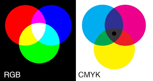
Most screens are red, green and blue, or RGB, (computer, phone, media player, television, etc.). The pixels have subpixels that just show red, green or blue.

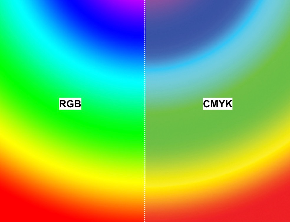
If an RGB version of the logo is accidentally used in digital CMYK space, it can print in unexpected ways as each printer will interpret the colors differently.

When to use RGB or Hex systems:

  • ✅ Websites and graphics for the web
  • ✅ Social media graphics
  • ✅ Video
  • ✅ Presentations
  • ✅ Other digital interfaces or uses
  • ✅ Print, ONLY if your printer specifies that they will do the color conversion to CMYK


Web color palette for asu.edu

Based on the ASU brand primary and secondary color palettes, the Unity Design System UI kit designates specific color use and combinations, and introduces a web-specific grayscale and alerts palette, for asu.edu. 

All color uses and combinations have been optimized for accessibility and are detailed in the Unity Design System UI kit for asu.edu. The UDS color palette encompasses all colors and hex codes approved for use on asu.edu.

For print work

CMYK process colors

Cyan, magenta, yellow and black, or CMYK for short, is a subtractive, reflected light color system. All colors start with white “paper,” to which different color “inks” are added to absorb (subtract) light that is reflected. 

If a CMYK version of the logo is accidentally used in digital RGB space, it looks washed out and diminished.

When to use CMYK:

  • ✅ Printed materials on office printer
  • ✅ Printed materials at professional printer

Pantone spot colors

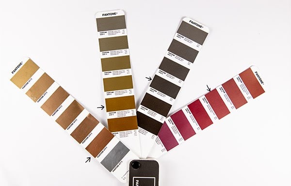
The Pantone color system is a worldwide color system that includes swatch books so that colors are the same around the world, no matter where they are printed. If you think of big brands that you know and recognize and picture their packaging and ads around the world, Pantone is probably part of the solution so that local printers can match the color direction from the brand’s color palette.

When to use Pantone spot colors (PMS):

  • ✅ With a printer who can make or order the custom Pantone ink colors
  • 🚫 Don’t use Pantone colors for ASU Maroon or ASU Gold for print. 

Custom spot colors for print: “ASU Maroon” and “ASU Gold”

ASU has established custom spot colors that will ensure better color consistency across all materials. The previous Pantone colors for Maroon and Gold have been retired.

The custom spot colors are based on the L*a*b color space which mathematically describes all perceivable colors in the three dimensions: 

  • L” for lightness 
  • A” for green to red 
  • B” for blue to yellow 
  • C” for chroma
  • H” for hue

One of the most important attributes of the L*a*b model is device independence. This means that the colors are defined independently of their nature of creation or the device they are displayed or printed on.

The Print and Imaging Lab always has ASU Maroon and Gold ink ready to print. 

For print vendors manufacturing ink: Only use yellow, rubine, Pantone process blue and neutral black when mixing ink to match these color chips.

L*a*b colors for coated paperL*a*b colors for uncoated paper
ASU Maroon, coatedASU Gold, coatedASU Maroon, uncoatedASU Gold, uncoated
L = 33.11
A = 43.17
B = 7.02
C = 43.74
H = 9.23
L = 81.06
A = 10.15
B = 71.44
C = 72.16
H = 81.91
L = 33.11
A = 43.17
B = 7.02
C = 43.74
H = 9.23
L = 82.95
A = 11.78
B = 66.56
C = 67.59
H = 79.96


Metallic ink colors

Metallic ink colors are sophisticated and powerful and used only in print applications

  • These ink colors are not to be used in digital mediums.
  • Metallic ink colors are never to replace colors in the ASU logo. 
  • They are to be used only as supporting spot colors, not to be converted to process colors.

Metallic ink swatches

Approved metallic ink colors (for print use only):


Metallic Maroon

PANTONE 8862 C

Metallic Gold

PANTONE 8384C

Metallic Gray 

PANTONE 8403C

Metallic Copper 

PANTONE 876C


Foil stamping

Foil stamping is a specialty printing process that uses heat, pressure, metal dies and a thin sheet of metal foil film.

  • Both maroon and gold foil must be used if replacing colors in an ASU logo (may not be all maroon or all gold).
  • Foiled stationery such as business cards, notecards and letterheads are reserved for President Crow’s Executive Committee. 

Allowed foil colors:

  • Maroon: HCS X621 foil
  • Gold: Great Western 138 foil

Order your color swatch book

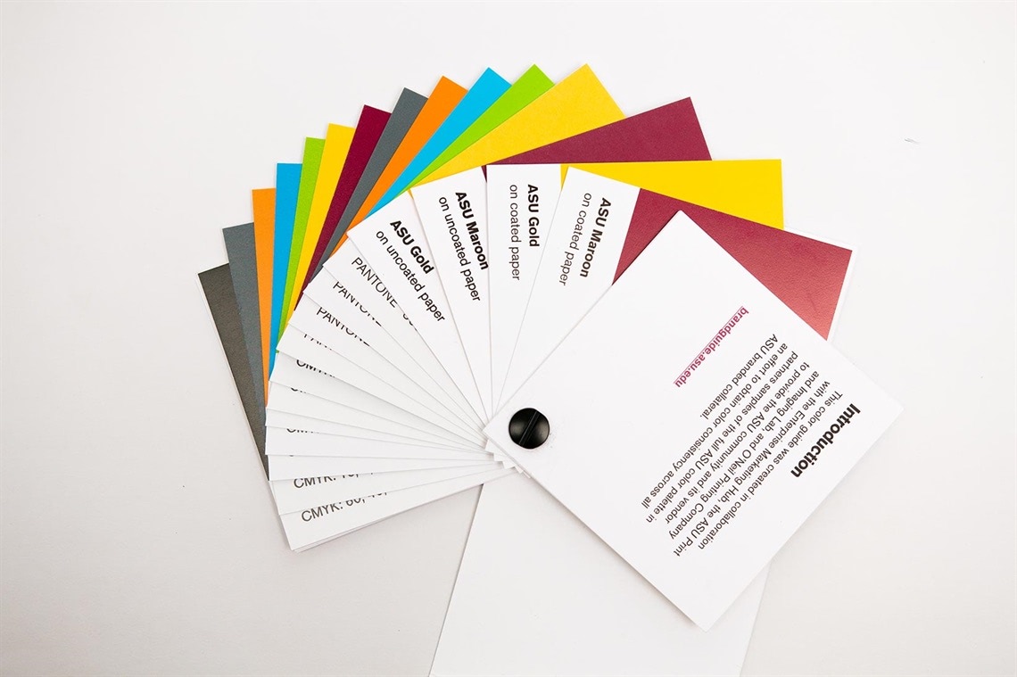
The swatch book includes printed samples of the full ASU color palette in an effort to obtain color consistency across all ASU-branded collateral.

Color swatch book

Visit ASU Print Online to order a swatch book created to support you and your contracted printers in managing the ASU brand colors.

Have questions about printing color? 

Many variables in the printing process can affect color reproduction, including paper color, quality, texture and various finishing processes. Contact the Print and Imaging Lab with any questions.