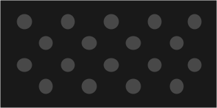
Patterns play a significant role in enhancing the visual appeal of communication materials and adding texture to the overall design. Brand patterns are not merely decorative elements but are chosen intentionally to reinforce the values and context of the university’s expertise and culture. ASU has a set of standard brand patterns, and units have the option to develop additional patterns that align with their identity.
Review background and pattern use guidelines for asu.edu.
The use of ASU brand patterns is guided by certain principles and guidelines, ensuring their meaningful representation. Here are some examples that illustrate the significance of the current patterns:
- “A” Mountain topographical map pattern: This pattern represents the topography of “A” Mountain. This pattern serves as a visual nod to the iconic mountain and its connection to the university.
- Learn to thrive® Morse code pattern: The morse code pattern translates to the phrase “Learn to Thrive.” This pattern symbolizes ASU’s commitment to empowering its students to thrive academically and personally.
- Network pattern: This pattern visually conveys ASU’s interconnectedness within our community as well as our global reach and influence. It can also be used to show connection among people and ideas.
- Plus pattern: This pattern symbolizes many meaningful qualities to the ASU community: unity, balance, positivity, growth and expansion. It also holds significant meaning in the mathematics and medical fields. Throughout Indigenous communities the plus or cross symbol represents stars and the cardinal directions — north, south, east and west, as well as the four sacred mountains.
- Arrow pattern: The arrow pattern symbolizes ASU’s forward momentum and advancement — always evolving and improving. Within Indigenous communities the arrows represent peace, alliance and strength. The arrows pointing to the right indicate protection and strength.
- Semiconductor pattern: This pattern represents the advancements that ASU continues to make in the semiconductor and tech industries. More broadly it symbolizes connection and new pathways forged by innovation.
Download patterns
Approved designs that can be used at scale:
“A” Mountain topographical map pattern
Learn to thrive morse code pattern
Network pattern
Plus pattern
Arrow pattern
Semiconductor pattern
Best practice design parameters
When designing new patterns for your unit or the broader ASU community, it is essential to follow best practices and consider the following parameters:
- Meaning: The pattern should be unique to ASU as much as possible and should have meaning for people in our community.
- Scalability: The pattern should maintain its visual appeal whether displayed at a large or small scale. It should add depth to the design without overpowering other elements.
- Line weight: Avoid using heavy line weights that are distracting and draw attention away from the surrounding content. Keep the contrast between graphic elements and background color minimal to ensure the focus remains on the messaging and other important design elements.
- Color: Choose subtle colors that do not divert attention from the main content. Utilize the approved ASU brand colors to maintain consistency and coherence within the overall visual identity.
- Repetition: Patterns tend to be more effective when they repeat both vertically and horizontally. This repetition reinforces the visual impact and creates a cohesive look across the design.
- Resolution: Create the master design file in a vector format and export it at high resolution (300dpi). This allows for easy scaling and ensures the pattern retains its quality across various use cases.
- Source: Patterns should be created by an ASU team member or partner rather than sourced from stock graphics. This helps maintain a unique and authentic visual identity as well as copyright protection and endurance through time for the university.
By adhering to these guidelines, your unit can create patterns that align with ASU’s brand identity, enhance visual appeal, and reinforce the intended messaging.
Pattern use details
Coloring
For asu.edu, approved color combinations for patterns utilize ASU grayscale and background color options.
The best practice CMYK print color combinations are as follows:
Gray 7 (0-0-0-2) on
White (0-0-0-0)
Gray 6 (1-0-1-8) on
White (0-0-0-0)
Gray 6 (1-0-1-8) on
Gray 7 (0-0-0-2)
Gray 2 (5-7-5-85) on Black (0-0-0-100)
The best practice HEX web color combinations are as follows:
Gray 7 (#FAFAFA) on
White (#FFFFFF)
Gray 6 (#E8E8E8) on
White (#FFFFFF)
Gray 6 (#E8E8E8) on
Gray 7 (#FAFAFA)
Gray 2 (#484848) on
Gray 1 (#191919)
Sizing and scale
Patterns are created as vector artwork in a square artboard and the design motif should seamlessly repeat vertically and horizontally. Keep in mind the scale at which the pattern will be viewed and ensure that the pattern adds depth and richness to the design instead of drawing the viewer’s attention away from the important information being conveyed.
Web patterns are exported to 512px by 512px.
Design
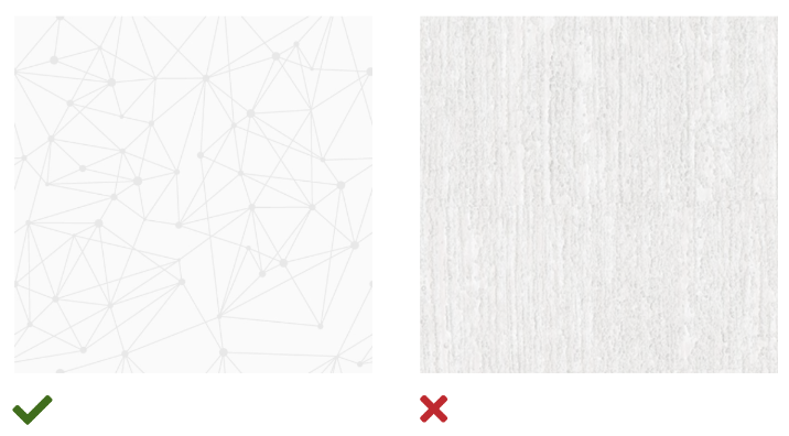
Patterns should use solid vector shapes as motifs. Photographic patterns are not permitted. Pattern designs and density may vary, but in general they must not distract from the primary content.
Text placement
When placing text on top of a background pattern, text must be placed into a container with a solid background and then placed on the pattern background. This ensures accessible contrast and legibility.


