
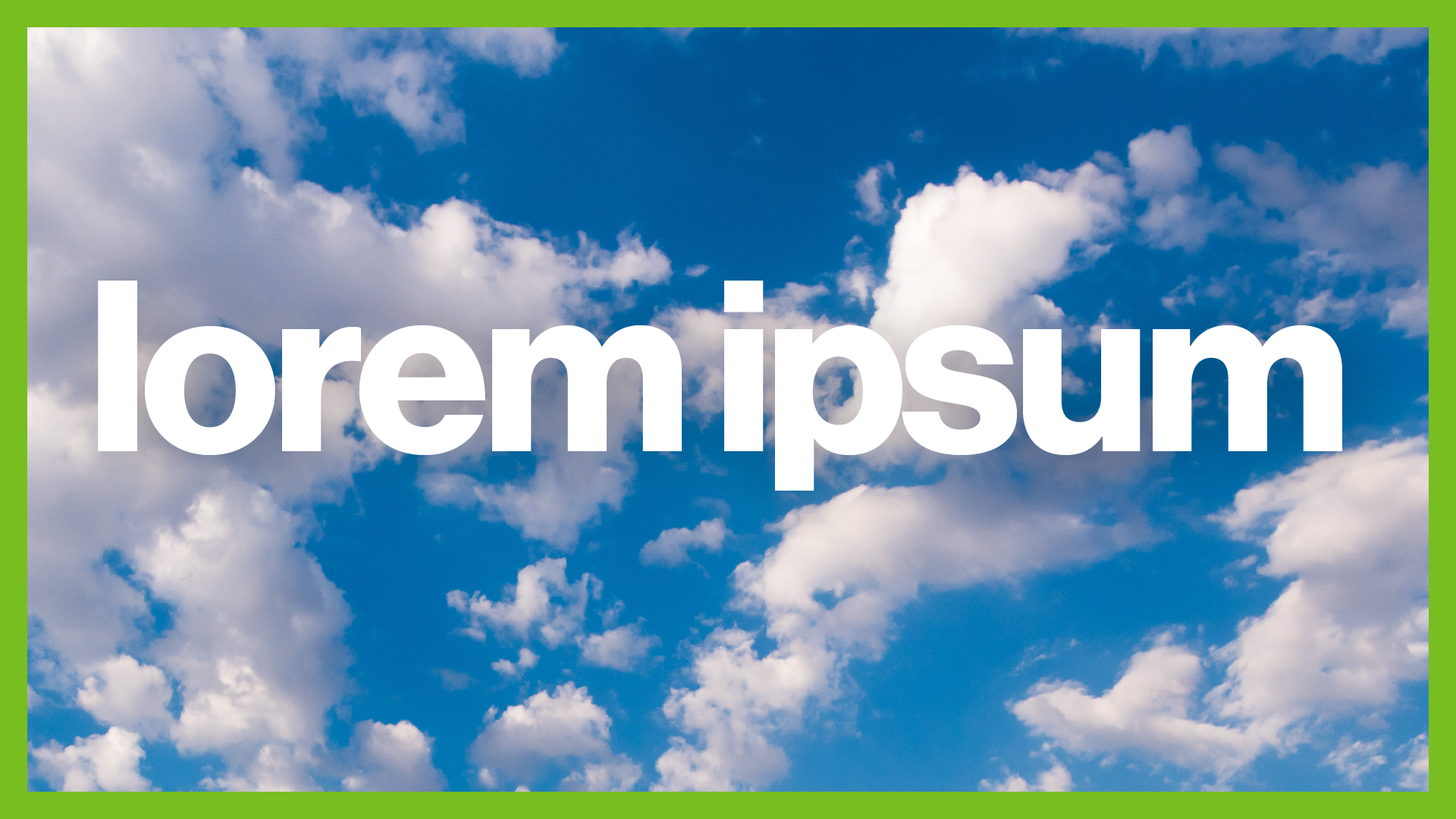
Typography and our selected font families are fundamental elements of our brand and help weave our stories together. Our goal is to create a seamless experience for our audiences by aligning all communication in a unified visual voice.
Do not use any additional fonts, including decorative and script fronts, as they interfere with the clear articulation of the ASU brand.
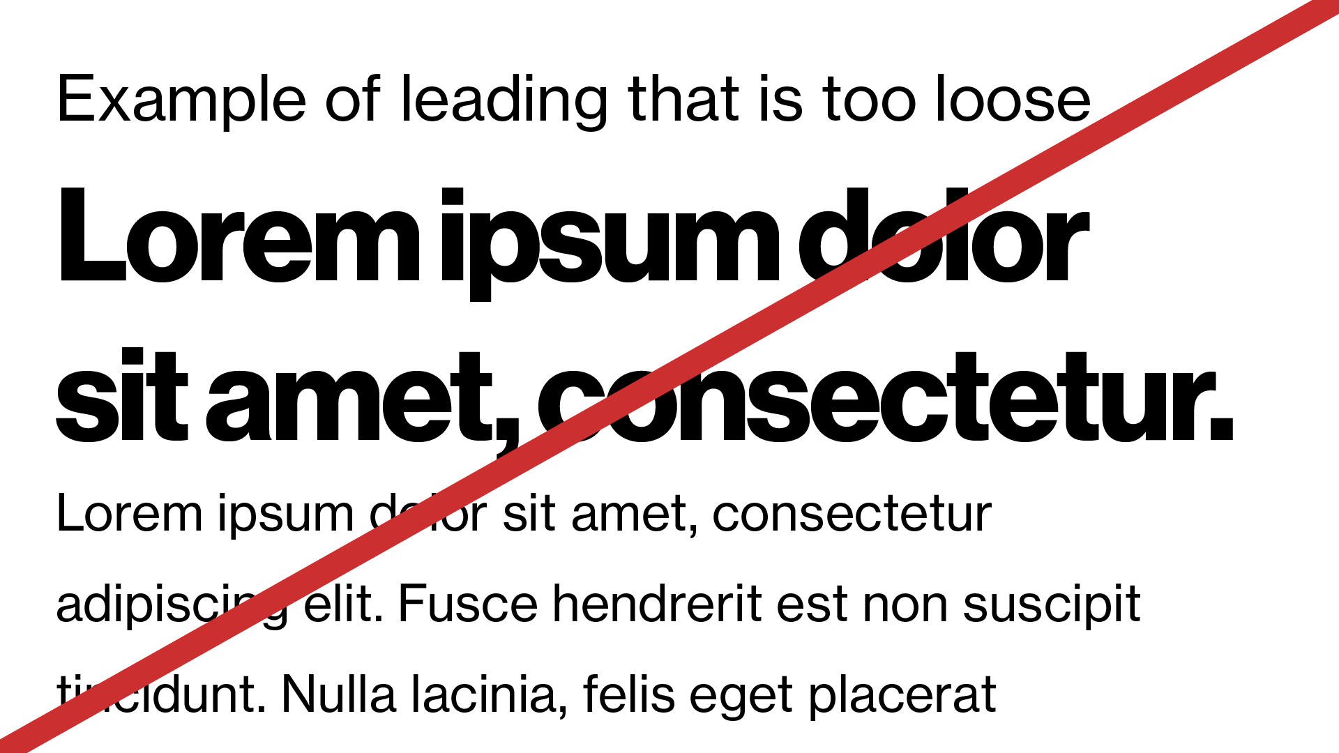
Using the approved brand fonts in print and digital formats larger than 7.5 points (pt) / 10 pixels (px) will ensure your message is readable.
Using fonts and typography to communicate the ASU brand
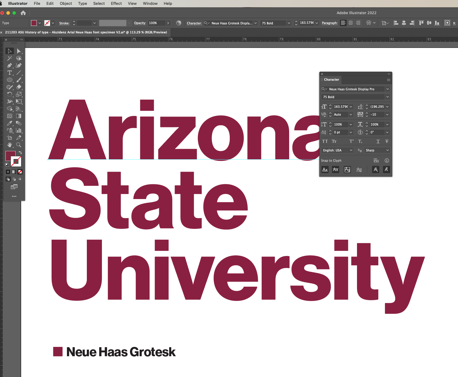
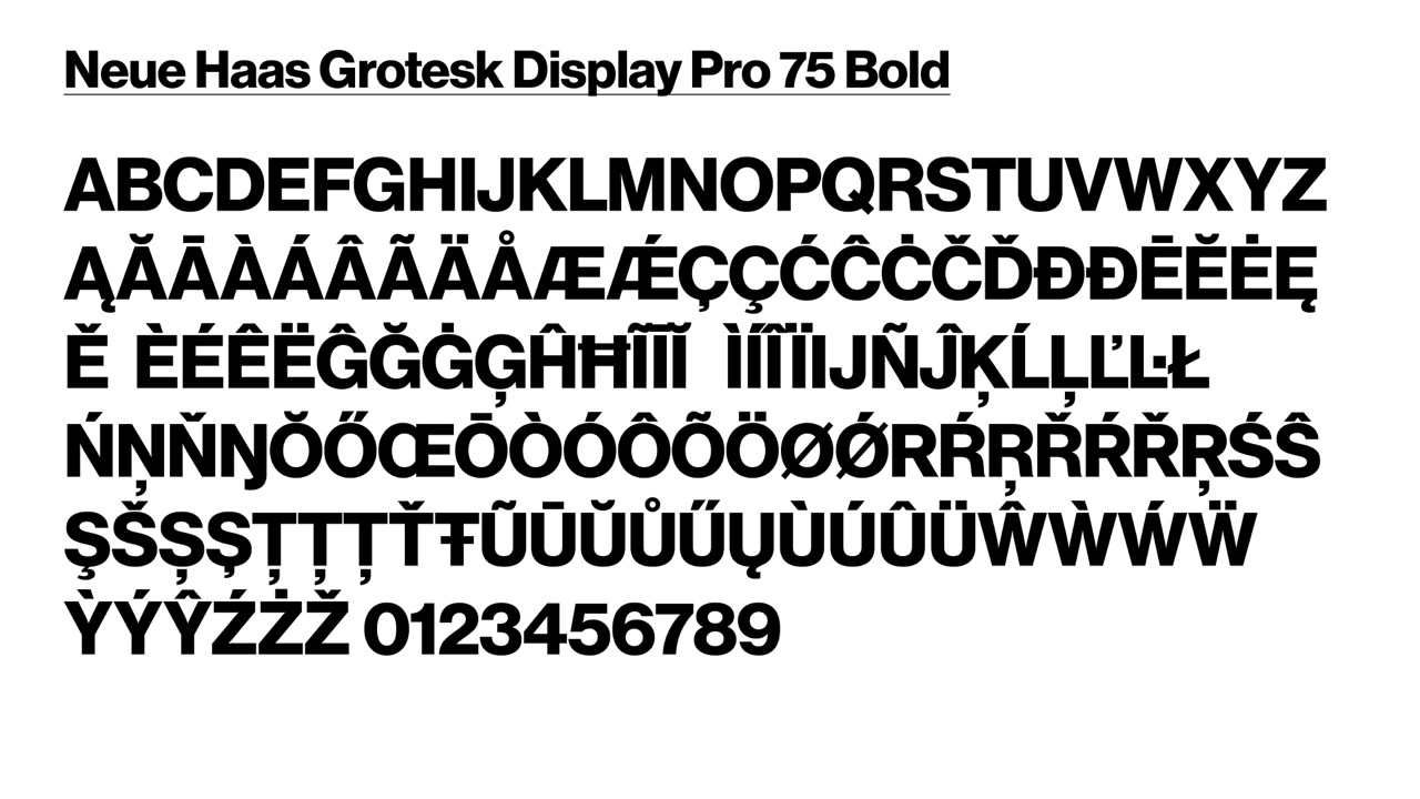
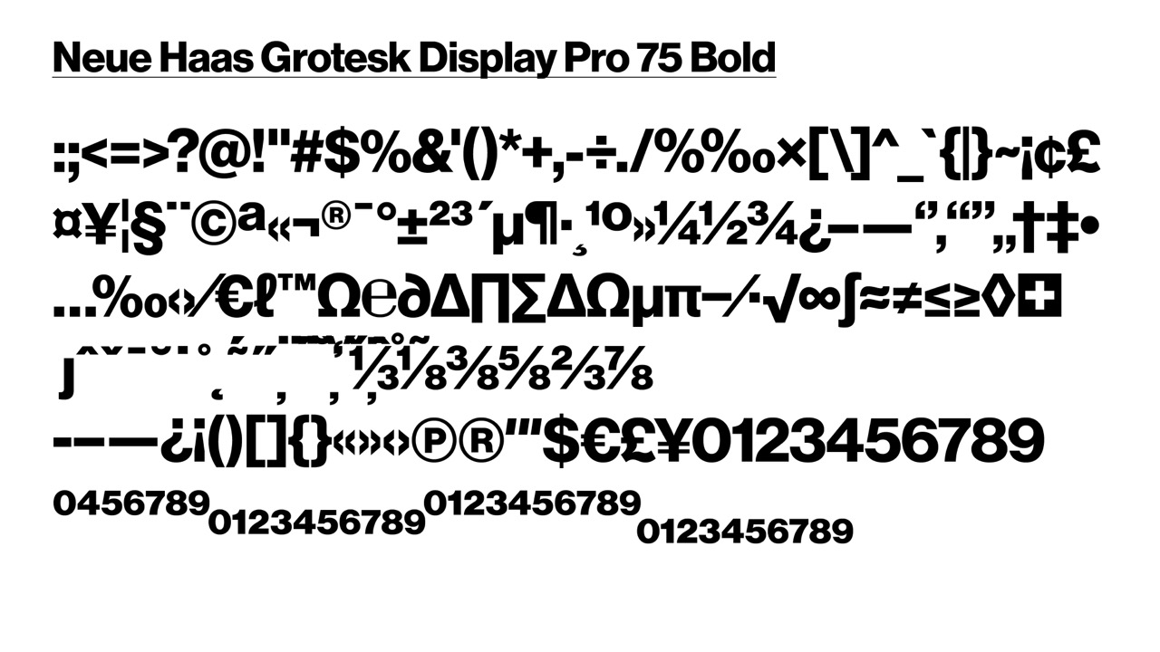
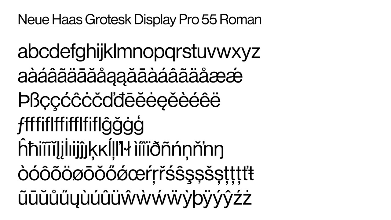
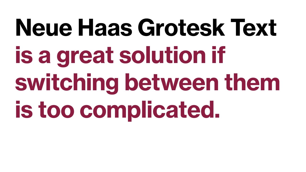
Primary print font: Neue Haas Grotesk
Neue Haas Grotesk, available through Adobe Fonts, is the primary font for print, video and all Adobe software uses. All ASU team members able to access Adobe Creative Cloud are encouraged to start using that font immediately.
Note: Brand elements such as the official logo, endorsed unit logos, permanent signage, and Canva designs are still being built with Akzidenz Grotesk.
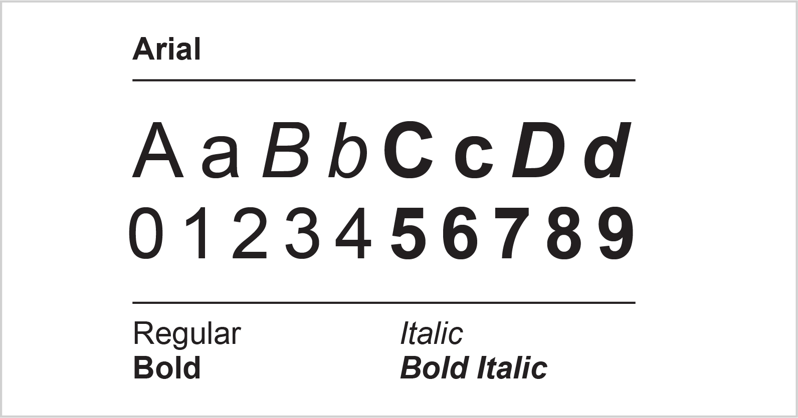
All other specific digital material will be created with Neue Haas Grotesk or Arial and include:
- Adobe InDesign – single and multi-page documents
- Adobe Illustrator – graphics and multiple artboard documents
- Adobe Photoshop – type on top of photos or other creative
- Adobe Premiere – video
- Adobe After Effects – animation and video
- Adobe Express – social media and other uses (note: Express is Adobe’s Canva-like software)
- Figma — UX and digital design
- Any other Adobe software that loads from the Adobe Fonts library
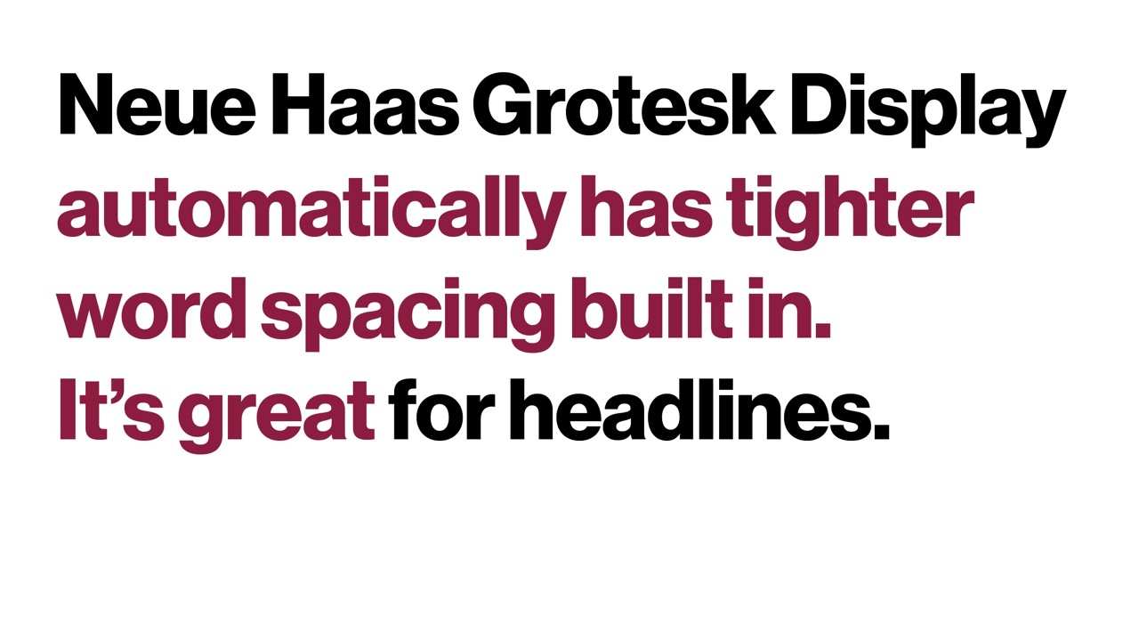
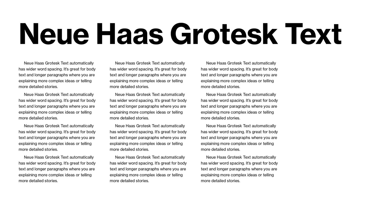
Neue Haas Grotesk has the same essential look and feel and will not look different from our previous materials to our audiences. It has the same boldness and strength as the previous font and is now available to all Adobe users through Adobe Fonts.
- All new team members may start using Neue Haas Grotesk immediately. Akzidenz Grotesk Std licenses will be phased out by July 1, 2023, and will be removed from computers by ET and local technology staff. Certain brand elements, including the official logo, endorsed unit logos and permanent signage will continue to be built with Akzidenz Grotesk. All other materials will be made with Neue Haas Grotesk.


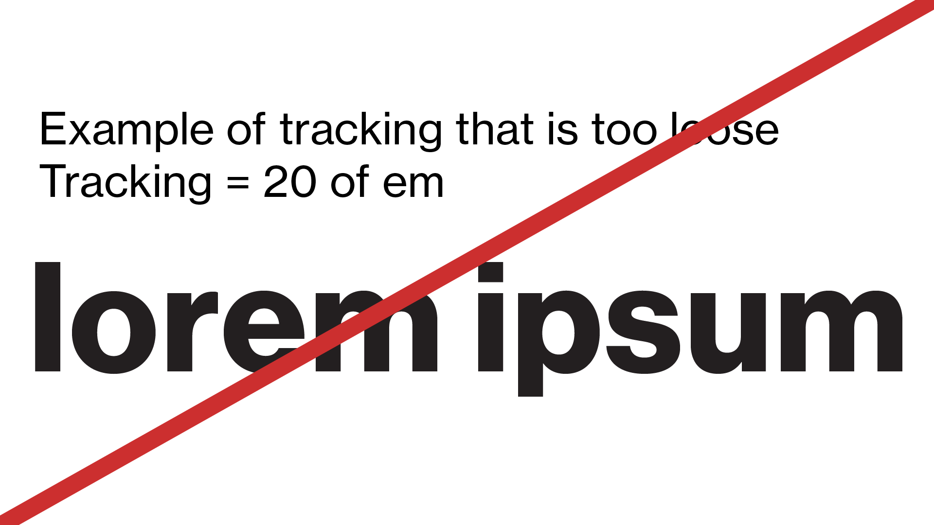
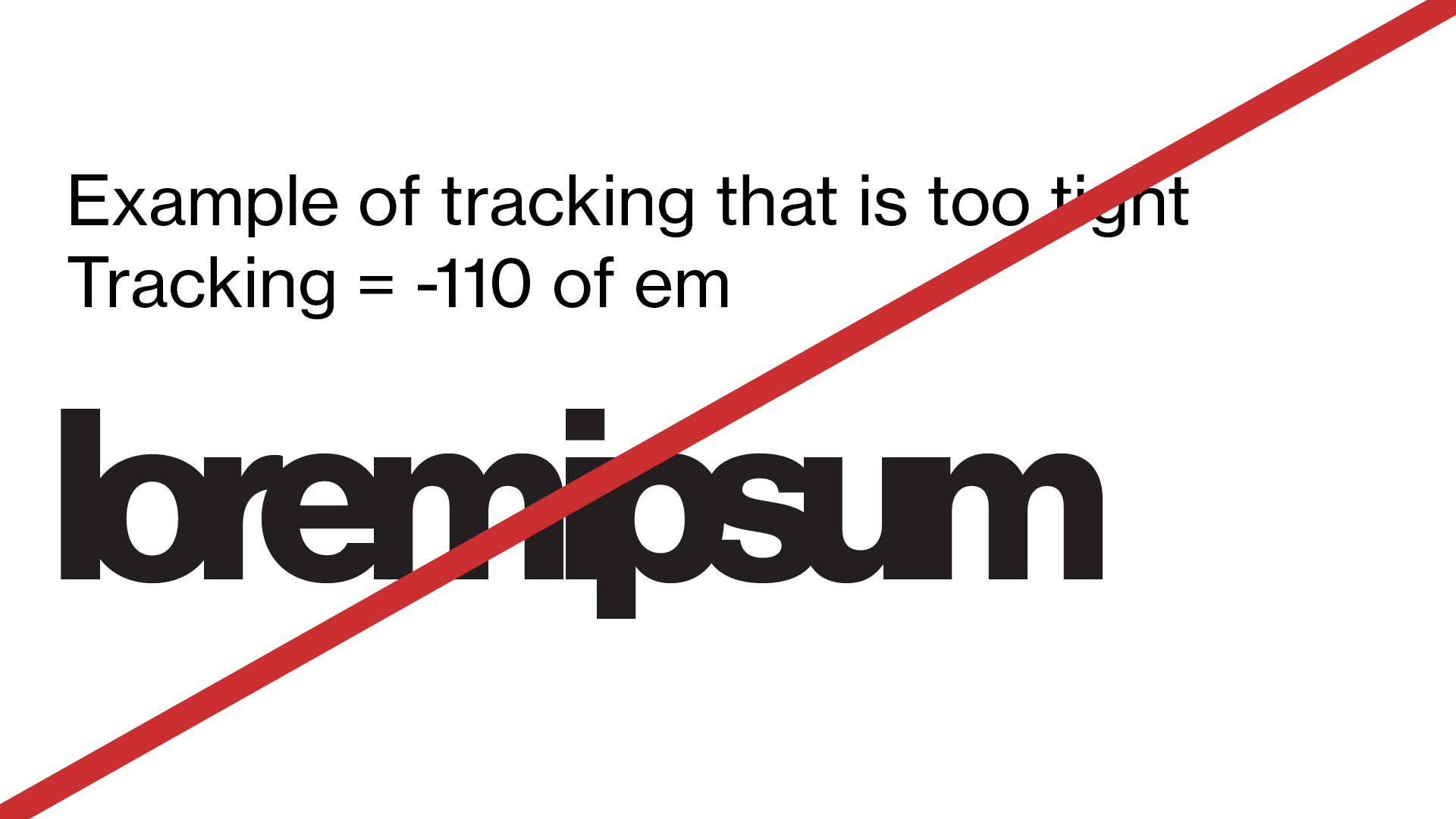