Brand Guide Content
Elements of the ASU brand

ASU logo

Either the ASU logo or an official ASU unit logo is the only graphic identity mark for all university campuses, units and endeavors. The logo must be included on all materials. Use of the ASU logo indicates agreement to abide by the university standards within the brand guide.

When multiple university units are represented, the logo of the umbrella unit that represents all of them should be used. In some cases, a college or school is the umbrella under which the units may be represented. In cases that cross units or report through different branches of the university, the university logo should be used as the umbrella. References to individual units themselves should occur in text format only.

The ASU sunburst

The sunburst logo was introduced in 1995, replacing all preexisting ASU logos. The logo is made up of a sun icon that is incorporated into the three letter forms (A, S and U) and provides a strong and recognizable graphic image of ASU’s mission and purpose.

Official logo versions

Use the original, high-quality graphic files and do not change them. Do not scan or recreate the logo. Do not use bitmapped images such as Tiff or Pact file formats for offset printed materials because of their poor reproduction quality.

High-quality files can be downloaded from the ASU Brand LibraryBy downloading the logo you are agreeing to abide by the university standards within the brand guide.

The EPS file format is scalable for high quality reproduction. Do not create additional file types, like SVG for the logos as these are not approved. PNG files are primarily used in digital materials.

Download ASU logo files

Note: By downloading the logo you are agreeing to abide by the university standards within the brand guide.
 

Options available for download from the ASU Brand Library

Learn how to access the ASU Brand Library. 

Maroon and gold — primary use

Background color options
White, transparent

Orientations:
Horizontal, vertical

File format:
EPS, PNG

White — for use on dark colors

Background color options
Black, transparent

Orientations:
Horizontal, vertical

File format:
EPS, PNG

Black — for limited use (with partner logos when both are black)

Background color options
White, transparent

Orientations:
Horizontal, vertical

File format:
EPS, PNG

University logo use details

Who may use the logo

The Arizona State University logos may be used only by faculty, staff and units of the university when conducting university business.

Voluntary faculty and staff organizations may not use these marks.

Most student organizations may not use the mark. 

However, paraprofessional student organizations may use the university’s marks when representing the university. Paraprofessional student organizations are groups registered with the Student Organization Resource Center whose primary purpose is to support Arizona State University in a particular area, such as admissions, community outreach or student government. Paraprofessional organizations include ASASU, Devils' Advocates, START and REACH. It is expected that these and similar groups will adopt graphic identities separate from the university; however, because the students represent the university in their roles, it is also expected that the ASU sunburst logo will be included on the sleeve of shirts used for identification purposes.

Any individual, organization or entity external to the university interested in using any of the university trademarks must contact ASU Trademark Licensing. Anyone internal to ASU must contact Enterprise Brand Strategy and Management.


Prominent location

Place a logo in a prominent position on all electronic and print communication. A unit logo is granted only under particular circumstances.

Only one ASU logo may be used on any materials, either the ASU logo or an ASU unit logo.


Minimum reproduction

Minimum reproduction of logos

The minimum print reproduction size is 5/16”.

logos minimum width

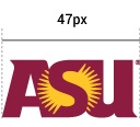
The minimum digital reproduction size is 47 pixels wide (to accommodate mobile app icons).

Area of isolation

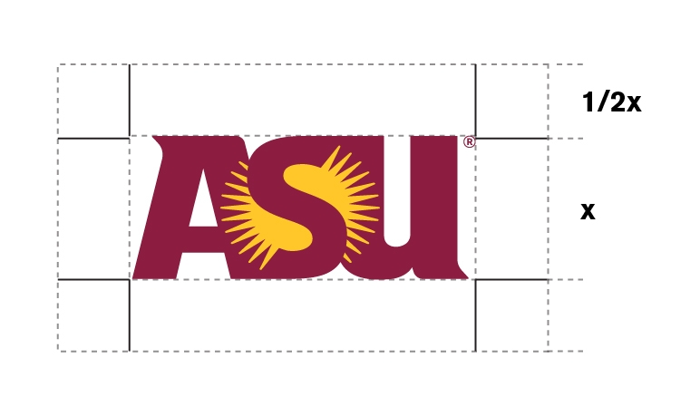
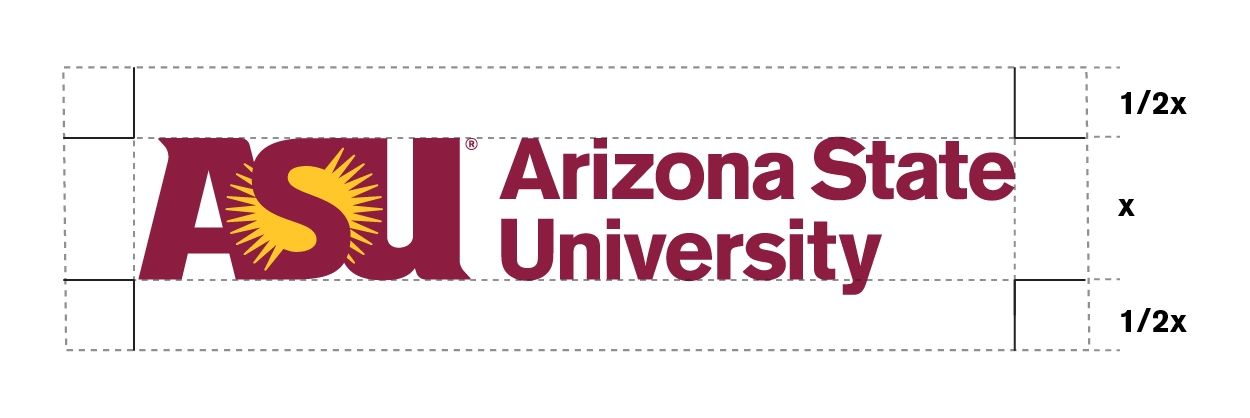
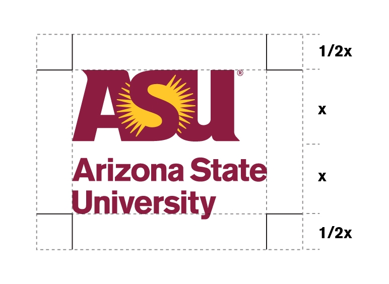
The protected area around the logo is called the “area of isolation." No graphic elements, titles, text, background color changes or other design elements may occur in this protected space.

The area of isolation is an area equal to half the height of the ASU sunburst and extends out on all four sides of the logo. In the example below, “x” equals the height of the ASU sunburst, and 1/2x on each side is considered the area of isolation.

ASU logos area of isolation small graphicArea of isolation example 2

Area of isolation example 1


For digital channels where space is limited by ad specifications and the full area of isolation cannot be achieved, the area of isolation can be reduced to 1/4x on each side, but should be 1/2x whenever possible.

Approved usage of university colors

Color

The logo and signature should be reproduced in the official university colors only. Below are the only approved color and usage combinations. No other combinations should ever be used. The logo may not be converted to gold coloring. The maroon and gold version of the logo is the preferred one to use whenever possible.

Differences in ink color may occur depending on the quality of paper or product material used. The final product must match the official ASU maroon and ASU gold.
 

Embossing, foil stamping, metallic inks

The logo, signature, athletic mascot and seal may be embossed or debossed. For information on foil stamping and metallic inks, see the Color Palette page.

Unacceptable logo modifications

Logo usage on photos and background colors

When using the configurations over a four-color photograph, the logo must be either maroon and gold or reversed to white. The placement of the logo should be in an area of the photograph where there are no distracting patterns or elements. When using the white logo or signature, the photograph should be seen through the sun area.

When placing an ASU logo on a solid background color, the accessibility of the combination of logo and background color must be accessible. Avoid using light logos on light backgrounds or dark logos on dark backgrounds.