An animation is a series of images or state changes that create an illusion of movement. It allows an element to change from one style to another.
For the purposes of these standards, animation includes website and mobile app element transitions, animated GIFs, parallax scrolling and code-based moving elements such as data visualizations and animated features
These standards apply to websites and mobile apps supported by departments, units, colleges and other communications teams, with the exception of accessibility standards, which are required for all ASU websites (including lab, faculty and classroom sites).
It is often tempting to add animation to a webpage to “make it look more innovative” or add an element of excitement. But seasoned web animators know that animation is powerful, and must be used correctly. Here are a few good reasons to incorporate animation:
Reduce cognitive load
Animations can cut the amount of effort needed for a user to understand an interaction. They can quickly give a user feedback, such as when a “daisy wheel” spins to indicate that the system is processing.
Focus attention
Animations can also bring the user’s attention to something new, or tell the user that an action needs to be taken (think of a “ringing bell” icon when a new social media message arrives).
They can also help prevent “change blindness” by calling attention to an element that has changed subtly.
Communicate content more effectively
Animation can be used in place of long paragraphs of text to demonstrate a concept or tell a story. It can be a better alternative to video for users with limited data access.
Some users with reading disabilities can engage with animated content more easily than with written words.
Accessibility
Web and mobile animations must follow WCAG 2.0 guidelines; they should be accessible and supportive to all users.
- Animations that convey meaning or content must include a text-based alternative. A transcription below the animation is acceptable.
- Any animation with audio must allow the user to control the audio. Any animation with more than three seconds of audio must provide play/pause/stop controls. Sound should not autoplay.
- Animations with audio that uses spoken words must be captioned, or a transcript must be provided below the animated element.
- Any animation that lasts more than five seconds, regardless of sound, must provide play/pause/stop controls. Animations that run on a continuous loop are considered to last more than five seconds.
- Animation controls must be placed in consistent locations and the click target must be at least 48x48 pixels.
- Color should not be used as a sole sensory indicator (e.g., “Place the green star on the red circle”).
- Be sensitive to users with vestibular disorders. Certain animations, especially in certain color combinations, can cause a feeling of illness.
- Parallax must be confined to small areas of the screen, as it can trigger illness.
- Do not use animations that can trigger epilepsy. Animations, including animated gifs, should not blink or flash more than three times per second. Avoid flashing fully saturated reds.
Subtlety
Animations used in element transitions (such as a dropdown or carousel slide) should be subtle and not call excessive attention to themselves. Avoid triggering several different animated elements on a page at the same time, as this might confuse the user.
Respect the user
When animating an element, ask:
- Does this support — or interrupt — a user’s task?
- Does it slow the user down or speed things up?
- Does it feel natural or obtrusive?
- Does it provide important information or is it a novelty?
Animations should only distract from the natural focus of the page’s content when necessary, such as to provide a notification or warn against a destructive possibility (such as the system logging the user out after too much inactivity).
Finally, animations should be consistent across the ASU ecosystem, and should seem familiar to what users encounter around the internet. Remember that most of our web visitors are visiting other ASU sites, and many are using more than one ASU mobile app. An “opening barn door” effect in your carousel might be fun, but it’s too different from other ASU sites and can cause confusion.
It takes as little as 13 milliseconds (ms) for our brains to "see" an image, which equates to about 80 frames per second; 90 frames per second is advised for virtual reality development.
Animations viewed from the center of a user’s cone of vision only need shorter durations (closer to the 70-200 ms spectrum) to complete due to the eye having less distance to travel.
Animations that are on the edge of the cone of vision, or peripheral vision, benefit from additional time for the user to move their eyes (300-700 ms). This allows users more time to recognize and identify objects moving into view.
Users’ eyes are very sensitive to changes in color when viewed directly. Therefore it is recommended that color and opacity changes take less than 100 ms.
Animating with CSS is preferred vs. javascript when possible.
Recommended timings
CSS transition-duration: accepts both seconds and milliseconds. The default timing is 0 seconds.
The average person takes approximately 215-230 ms to react to a visual change.
200-500 ms is the recommended starting point to complete an animation. From there the animation can be fine-tuned so that it feels right.
Time conversion reference
| Seconds |
.25s |
.50s |
.75 |
1s |
| Milliseconds |
250 ms |
500 ms< |
750 ms |
1000 ms |
- Timing may be written in either second (css) or milliseconds (css and js).
- 100 ms / .1s : provides an immediate feeling for fades and color-based animations.
- 300 ms / .3s : provides a fast, responsive feel.
- 400 ms / .4s : provides a slower feel for moving elements on the screen.
- 700 ms / .7s : provides a deliberate feel for larger movements across the screen.
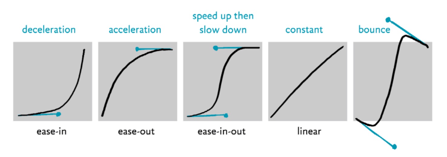
Cubic béziers are formulas used to mathematically describe a rate of change and support easing, which makes transitions seem more natural. See cubic-bezier.com and Easing.net for tools to create cubic béziers.
Transitions
A transition moves the user from state to state. Abrupt changes in an interface are hard for users to process; conversely, a well-designed transition enables the user to clearly understand where their attention should be focused.
Some common concepts used in creating transitions include:
Transition types:
✅ = Brand aligned ⚠️ = Limited use ❌ = Do not use
- Easing (FKA Tweening) — Displays a seamless progression of changes applied to a component or element over time. Example: a square tweens into a circle, or a blue button tweens to red.
- Fading — Tweening an element’s opacity. Example: an image fades away to nothing. Proceed with caution: fading can feel dated or dreamy — not bold and contemporary like ASU.
- ⚠️ Fading is allowed, but here’s how and where:
- ⚠️ Fade through — Involves one element fading out completely before a new one fades in. Can be applied to text, icons, or elements that don’t perfectly overlap. https://material.io/design/motion/the-motion-system.html#fade-through.
- ⚠️ Dissolve — Creates a smooth transition between elements that completely overlap one another. Example: A foreground element fades in or out to show or hide an element behind it.
- ⚠️ Cross-dissolve — Involves two elements fading simultaneously. One fades in while the other fades out.
- Can feel dated, dreamy or whimsical — not bold and exciting like ASU.
- Shared transformation — Synchronizes element movements to enhance continuity. Example: Icons smoothly express a change while in motion versus switching suddenly.
- Slide — An element moves into a scene from one of the sides.
- ❌ Not for page transitions or uncontained page movement — can be jarring.
- ✅ Carousels or other self-contained components.
- Scale — An element becomes larger or smaller.
- ❌ Not for page transitions or on page (section) movement, can be jarring.
- ✅ Buttons, small clickable elements (cards).
- Recolor — Animated change of background and/or text color. Example: A button becomes a brighter shade of maroon on hover.
- Proceed with caution as this effect often breaks the brand color palette.
- Some opacity changes are acceptable, but keep ADA color requirements in mind (important text, etc., should always be legible).
- Try to limit this effect to items that are decorative .
- ❌ Color change — the transition from one color to a different color.
- ✅ Opacity change — the transition of transparency of one color.
- Rotate — An element moves clockwise or counter-clockwise.
- For icons, small elements, not combined with other items — displays current state (open, etc.) 180 degrees max.
- Most rotations should be clockwise, unless it ties into action being taken (ex: closing an accordion would be counterclockwise, reversing the opening motion).
Carousels
Allow a second for every three words on the slide before advancing. Test the timing with to see if it is too fast or slow. Consider turning off auto-advancing if there is significant variation in content amount between slides. Carousels that automatically advance should use five or fewer slides.
Slides should continuously rotate, returning the user back to the first slide once the end is reached.
Carousels must provide user controls to start, stop and pause.
- The controls should be in a consistent place and distinct enough from the background to be noticeable.
- Navigation controls should be inside of the carousel, not outside or below the fold.
- Controls should Indicate how many frames are present and where the user is in the progression.
- The slideshow must pause on keyboard focus and mouse hover.
Provide alternatives for users who can’t engage with a carousel. Use alt tags on carousel images. If a carousel image is purely decorative or is fully described by text that is not part of the image, use an empty alt tag.
Transitions should be a fade or cross dissolve effect between 600 and 1200 ms. UX testing has shown that users prefer faster transitions.
Additional resources