ASU primary colors
ASU Maroon and Gold, Rich Black and White are ASU's primary colors. Over many years, ASU has built brand equity in maroon and gold. These two colors define who we are as an educational institution and all digital and multicolor print designs should lead with the primary brand colors.
ASU grayscale
The ASU grayscale is a seven-step scale based on the values of ASU Maroon and ASU Gold and was developed for asu.edu user interface components. ASU Gray is a part of this scale.
To improve accessibility and readability for all sighted readers by reducing contrast, Gray 1 is used as black and Gray 7 as white on asu.edu.
Understanding which color build to use for your project
Please note the specific color values set for digital, print and specialty printing. They have been chosen based on years of review and prototyping, dialing in the color values with our trusted vendors and partners.
For digital work
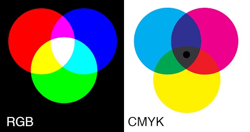
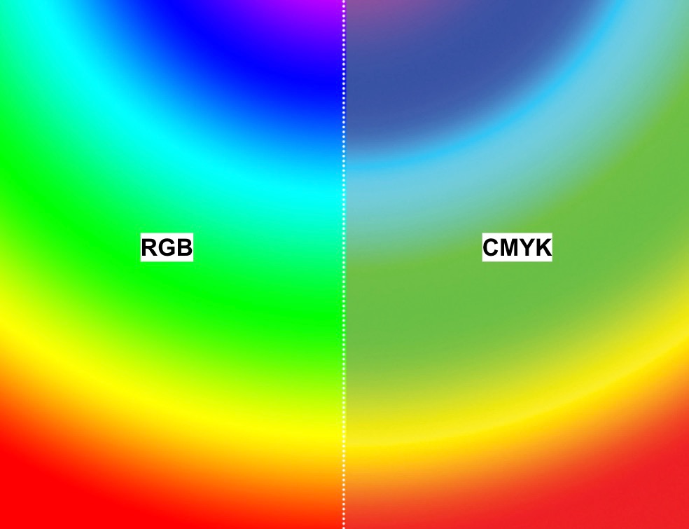
RGB colors
Most screens are red, green and blue, or RGB, (computer, phone, media player, television, etc.). The pixels have subpixels that just show red, green or blue.
If an RGB version of the logo is accidentally used in digital CMYK space, it can print in unexpected ways as each printer will interpret the colors differently.
When to use RGB or Hex systems:
- ✅ Websites and graphics for the web
- ✅ Social media graphics
- ✅ Video
- ✅ Presentations
- ✅ Other digital interfaces or uses
- ✅ Print, ONLY if your printer specifies that they will do the color conversion to CMYK
Web color palette for asu.edu
Based on the ASU brand primary and secondary color palettes, the Unity Design System UI kit designates specific color use and combinations, and introduces a web-specific grayscale and alerts palette, for asu.edu.
All color uses and combinations have been optimized for accessibility and are detailed in the Unity Design System UI kit for asu.edu. The UDS color palette encompasses all colors and hex codes approved for use on asu.edu.
For print work
CMYK process colors
Cyan, magenta, yellow and black, or CMYK for short, is a subtractive, reflected light color system. All colors start with white “paper,” to which different color “inks” are added to absorb (subtract) light that is reflected.
If a CMYK version of the logo is accidentally used in digital RGB space, it looks washed out and diminished.
When to use CMYK:
- ✅ Printed materials on office printer
- ✅ Printed materials at professional printer
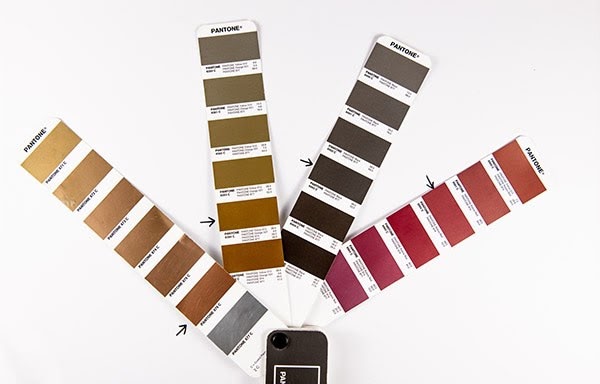
Pantone spot colors
The Pantone color system is a worldwide color system that includes swatch books so that colors are the same around the world, no matter where they are printed. If you think of big brands that you know and recognize and picture their packaging and ads around the world, Pantone is probably part of the solution so that local printers can match the color direction from the brand’s color palette.
When to use Pantone spot colors (PMS):
- ✅ With a printer who can make or order the custom Pantone ink colors
- 🚫 Don’t use Pantone colors for ASU Maroon or ASU Gold for print.
Custom spot colors for print: “ASU Maroon” and “ASU Gold”
ASU has established custom spot colors that will ensure better color consistency across all materials. The previous Pantone colors for Maroon and Gold have been retired.
The custom spot colors are based on the L*a*b color space which mathematically describes all perceivable colors in the three dimensions:
- “L” for lightness
- “A” for green to red
- “B” for blue to yellow
- “C” for chroma
- “H” for hue
One of the most important attributes of the L*a*b model is device independence. This means that the colors are defined independently of their nature of creation or the device they are displayed or printed on.
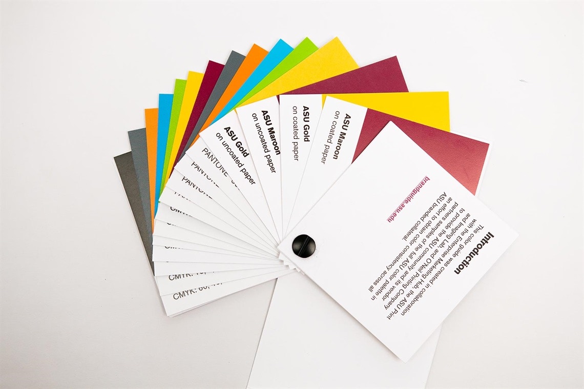
The Print and Imaging Lab always has ASU Maroon and Gold ink ready to print.
For print vendors manufacturing ink: Only use yellow, rubine, Pantone process blue and neutral black when mixing ink to match these color chips.
Visit ASU Print Online to order a swatch book created to support you and your contracted printers in managing the ASU brand colors.